
Why Data Product Success Metrics Are Lying to You
We built a customer segmentation platform that became the highest-adopted data product in company history. Three hundred seventy-two active users in the first quarter. A 94% satisfaction score in our feedback survey. Leadership cited it in the all-hands as proof our data team was delivering. Six months later, we discovered the platform had increased the average time-to-decision by 11 days and spawned 47 competing analysis workflows across departments because nobody could agree on which segment definitions to use. According to Gartner’s 2024 Analytics and BI Survey, 67% of data and analytics leaders report that their teams struggle to demonstrate business value despite high user engagement scores.
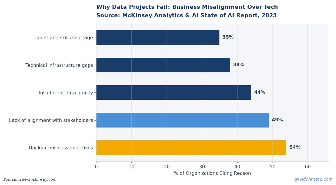
The problem is not that we measured adoption wrong. The problem is that adoption, engagement, and user satisfaction are borrowed from consumer product playbooks where more usage genuinely means more value. For internal data products, high engagement can mask organizational dysfunction. A dashboard that 200 people check daily might mean you have created an essential decision-support tool. Or it might mean you have institutionalized a data bottleneck that forces every analyst to manually verify numbers before trusting them.
Most data product teams enter Q3 reviews armed with metrics that make them look successful when they are actually creating drag. This is not a communication problem. This is a measurement framework problem.
The Decision Velocity Gap: What Actually Breaks During Budget Season
When finance teams start cutting headcount and tools during Q4 planning, data products get evaluated on cost-per-user, engagement trends, and survey scores. These metrics tell you nothing about whether the product is accelerating or slowing down the decisions it was built to support. The cost is immediate and visible. The value is assumed from proxy signals that do not measure decision impact.
Here is what breaks: a data product with 400 monthly active users and an NPS of 72 still gets cut if the CFO cannot see a line between that product and faster revenue decisions, reduced operational cost, or eliminated manual work. User satisfaction does not translate to finance language. Decision velocity does. According to McKinsey’s 2023 study on data-driven organizations, companies that measure decision speed alongside data quality see 2.3 times higher ROI on analytics investments than those tracking engagement alone.
David Ohnstad saw this firsthand at a previous role where a pricing analytics platform had stellar engagement metrics but was quietly increasing the time required to finalize contract approvals. Sales reps were using the platform to generate pricing scenarios, then re-creating the analysis in spreadsheets to verify the logic before presenting to leadership. The platform was adopted. It was not trusted. That distinction only surfaced when someone mapped the full contract approval workflow and discovered the platform had become an additional review step, not a replacement for manual analysis.
The lesson: high usage does not mean high trust. High trust is what eliminates redundant work. If your data product is not reducing query volume, cutting approval cycles, or retiring manual processes, engagement metrics are measuring activity, not value.
The Impact Decomposition Framework: Four Metrics That Predict Retention
Most data product managers defend their roadmaps with adoption curves and feature usage heatmaps. These matter for consumer products where engagement correlates with revenue. For internal data products, you need a different stack. This is a four-layer model that measures whether your product is actually changing how decisions get made or just adding to the process.
Layer 1: Query Elimination Rate. Track how many redundant queries, manual reports, or duplicate analyses your product has retired. This is the inverse of adoption — you want usage to go down in specific places because your product has replaced them. At Veeam, David Ohnstad worked on a pipeline monitoring product where success was not how many people used the dashboard, but how many fewer Slack messages went to the data engineering team asking “Is the pipeline broken?” A 40% reduction in support queries over three months signaled the product was working. The dashboard usage stayed flat, but the support burden dropped. That is the metric that justified the headcount.
Layer 2: Decision Cycle Compression. Measure the time between data request and decision execution for the workflows your product supports. If you built a margin analysis tool for pricing teams, the relevant metric is not how often it gets opened — it is whether contract approvals that used to take 9 days now take 6. This requires instrumenting workflows outside your product, which most teams skip because it is hard. That is exactly why it is valuable. The teams that measure this are the ones that survive budget cuts.
Layer 3: Data Debt Reduction. Count how many shadow datasets, unofficial transforms, or manual reconciliation steps your product has eliminated. Every spreadsheet that pulls from your warehouse and applies custom logic is technical debt. Every “clean” version of a table that lives in someone’s personal schema is a data quality risk. A data product that centralizes customer segmentation should reduce the number of segmentation models in production, not add to them. Track this monthly. If your product launches and the number of competing definitions increases, you have not solved the problem — you have made it worse.
Layer 4: Trust Verification Bypass. This is the hardest one to instrument and the most predictive of long-term retention. Measure how often users validate your product’s output against another source before acting on it. If analysts are pulling data from your product, then cross-checking it in another tool or spreadsheet before sharing with leadership, your product is not trusted. It is tolerated. The way to measure this: track which reports get exported, modified, and re-uploaded versus which get shared directly. A healthy data product has a high share-through rate. A product that is not trusted shows high export volume with low direct sharing.
This framework shifts the conversation from “How many people are using this?” to “How many decisions are faster, cheaper, or more confident because this exists?” That is the question finance teams actually care about when they review your budget in Q4.
Why This Matters More in Q3 Than Any Other Quarter
Most product teams treat Q3 reviews as a retrospective exercise. For data products, Q3 is when next year’s funding gets decided. Leadership is not asking “Did you ship features?” They are asking “Should we keep funding this, expand it, or cut it?” The teams that survive are the ones that can tie their product to measurable business outcomes using the language finance and operations understand.
Here is the problem: if you have spent the last three quarters tracking adoption, engagement, and NPS, you do not have the data to make that case. You have user satisfaction scores. Finance does not budget based on satisfaction. They budget based on cost avoidance, revenue acceleration, or operational efficiency. According to Forrester’s 2024 report on data and analytics investments, 58% of enterprise data initiatives fail to secure continued funding after the first year because teams cannot translate usage metrics into financial impact.
David Ohnstad has seen this gap kill products that were genuinely useful. A few years ago, a customer health scoring model he helped build had 200+ weekly active users across sales and customer success. The team presented engagement trends and survey feedback in the Q3 review. Finance asked one question: “How much faster are renewal decisions happening because of this model?” Nobody had measured that. The product got defunded. Not because it was not valuable — because the team could not prove the value in terms leadership could budget against.
The contrarian take: stop measuring data products like you measure SaaS apps. Your users are not paying you with dollars. They are paying you with trust and time. If your product does not reduce the time they spend verifying data or eliminate redundant work, high engagement means you have built a step in the process, not a solution to the problem.
The AI Measurement Constraint Nobody Talks About
If your data product includes any AI or machine learning components — forecasting, classification, recommendation engines — the measurement problem compounds. Most teams treat model performance metrics (accuracy, precision, recall) as product success metrics. They are not. A model with 92% accuracy that nobody trusts is not a successful product. It is a science experiment.
The issue is that AI/ML engineering decisions around model governance, monitoring infrastructure, and explainability directly constrain what product-level metrics you can even capture. If your ML engineers built a model that cannot log prediction confidence scores or surface feature importance, you cannot measure trust verification bypass. If your model pipeline does not track which predictions get overridden by users, you cannot measure decision cycle compression. As David Ohnstad on AI and enterprise SaaS has explored in depth, the infrastructure choices made during model development define what product metrics are even possible to calculate later.
This is why data product managers need to be in the room when AI/ML architecture decisions get made. If you wait until the model is deployed to think about measurement, you have already locked yourself into a limited set of proxy metrics. The teams that get this right define the instrumentation requirements before the first training run.
Leadership Capability Gaps That Kill Execution
Even with the right metrics framework, execution fails when leadership does not understand how to interpret decision velocity data or translate it into roadmap trade-offs. A common failure mode: a product leader sees that decision cycle time has dropped by 15% and interprets that as success without checking whether total decision volume has increased. If your product cut decision time but also made people question more decisions because the data is harder to interpret, you have not improved velocity — you have shifted the bottleneck.
This is where leadership and team execution capability directly impacts whether your data product strategy delivers or stalls. As David Ohnstad on leadership and career growth has written about, the ability to coach teams through ambiguous measurement problems and translate complex data outcomes into executive language is not a soft skill — it is the skill that determines whether your product survives budget season. A technically excellent data product with a leader who cannot defend its value in CFO language gets cut. A mediocre product with a leader who can tie it to cost avoidance or revenue impact gets funded.
The gap is real. Most data product managers come from analytics or engineering backgrounds where they learned to optimize models and pipelines, not to navigate budget politics or coach stakeholders through metric interpretation. That is a career ceiling. Learning to build the right measurement framework matters. Learning to use it in a room full of finance and operations leaders matters more.
What to Do This Week If You Are Heading Into Q3 Reviews
If you are presenting a data product in the next 30 days and your slide deck is full of adoption curves, user satisfaction scores, and feature release timelines, rebuild it. Finance and operations leaders do not budget based on those signals. They budget based on measurable impact to cost, speed, or quality of business decisions.
Start by mapping the decision workflows your product was supposed to improve. Not the use cases you pitched in the roadmap deck. The actual business decisions. For each one, identify the baseline time-to-decision before your product launched and the current time-to-decision. If you do not have that data, you cannot make a retention case. Instrument it this week. Track one decision workflow end-to-end. Measure how long it takes. Compare it to the manual process it replaced. That is your headline metric.
Next, count how many redundant data sources, shadow datasets, or manual reports your product has eliminated. If the answer is zero — if your product added to the data landscape without retiring anything — you have a problem. Data products that increase total data infrastructure complexity without reducing manual work do not survive budget cuts. Find one thing your product has replaced and put that number in the deck.
Finally, ask your most active users this question: “When you pull data from this product, do you verify it against another source before acting on it?” If the answer is yes, your product is not trusted. It does not matter how high your NPS is. Trust verification bypass is the metric that predicts whether people will fight to keep your product funded or let it quietly disappear in Q4 cuts.
What metrics should data product managers use instead of adoption rates?
Data product managers should measure query elimination rate, decision cycle compression, data debt reduction, and trust verification bypass. These metrics capture whether a product is actually changing how decisions get made, not just adding another step to the process. Adoption and engagement are useful as secondary signals, but they do not predict retention or justify budget in finance reviews the way decision velocity and cost avoidance do.
How do you measure decision velocity for internal data products?
Measure decision velocity by tracking the time between data request and decision execution for workflows your product supports. Instrument one end-to-end decision process, measure the baseline time before your product launched, and compare it to current cycle time. If contract approvals used to take 9 days and now take 6, that 33% reduction is your velocity metric. This requires tracking workflows outside your product, which is why most teams skip it and rely on engagement proxies instead.
Why do data products with high engagement still get defunded?
Data products with high engagement get defunded when they cannot demonstrate measurable impact on decision speed, cost reduction, or data quality. Engagement metrics show activity, not value. If users are checking a dashboard daily but still verifying the output in spreadsheets before acting, high engagement signals low trust. Finance teams budget based on business impact, not user satisfaction scores. Products that cannot tie usage to faster decisions or eliminated manual work do not survive Q4 budget reviews.
The One Question Every Data PM Should Answer Before October 1
For practitioners: if your data product disappeared tomorrow, which decisions would take longer, cost more, or require manual work that is currently automated? If you cannot name three specific decisions with measurable time or cost differences, you do not have a defensible budget case. Build that map this week. Instrument one workflow end-to-end. Get the baseline. That number is worth more than any adoption curve when you are sitting in a room with finance leaders deciding what gets funded next year.
For leaders: the teams that will ask you to defend data product budgets in Q4 are not going to accept engagement metrics as proof of value. They are going to ask whether the product reduced cost, accelerated revenue, or eliminated risk. If your product managers cannot answer that question with specific numbers, they are not ready for the conversation. Coach them through the measurement framework now, before the budget cycle starts. The difference between a product that gets expanded and one that gets cut is not the quality of the dashboard. It is the quality of the business case. As explored in Data Product Manager Salary Gap: Why and How to Fix It, the ability to translate technical delivery into measurable business outcomes is the skill that separates senior data PMs from those who plateau at mid-level roles.
Here is the question that should make you uncomfortable: when was the last time you measured whether your data product is making decisions faster, or just making your users busier? If the answer is never, your Q3 review is going to be harder than it needs to be. The measurement infrastructure you build this week determines whether your product survives the Q4 budget conversation. Most teams wait until they are in the room to realize they are missing the data. That is too late. The time to instrument decision velocity is now, while you still have a quarter to prove it matters.
For more on this topic, see Data Product Management: Why 82% of Analytics Fail.
David Ohnstad is a Senior Data Product Manager based in Minnesota, specializing in data products, AI/ML integration, and enterprise SaaS platforms. Connect on LinkedIn or read more at davidohnstad.com.
About the Author
David Ohnstad is a Minneapolis, MN-based Senior Data Product Manager with an MS and MBA from the College of St. Scholastica. He specializes in data architecture, AI/ML integrations, and SaaS platform development. Outside work, he builds furniture and explores the Minnesota outdoors. Find his work at davidohnstad.com and github.com/davidohnstad40-netizen.
