
Photo by Vitaly Gariev on Unsplash
The Q2 Wake-Up Call: When 87% Adoption Meant Nothing
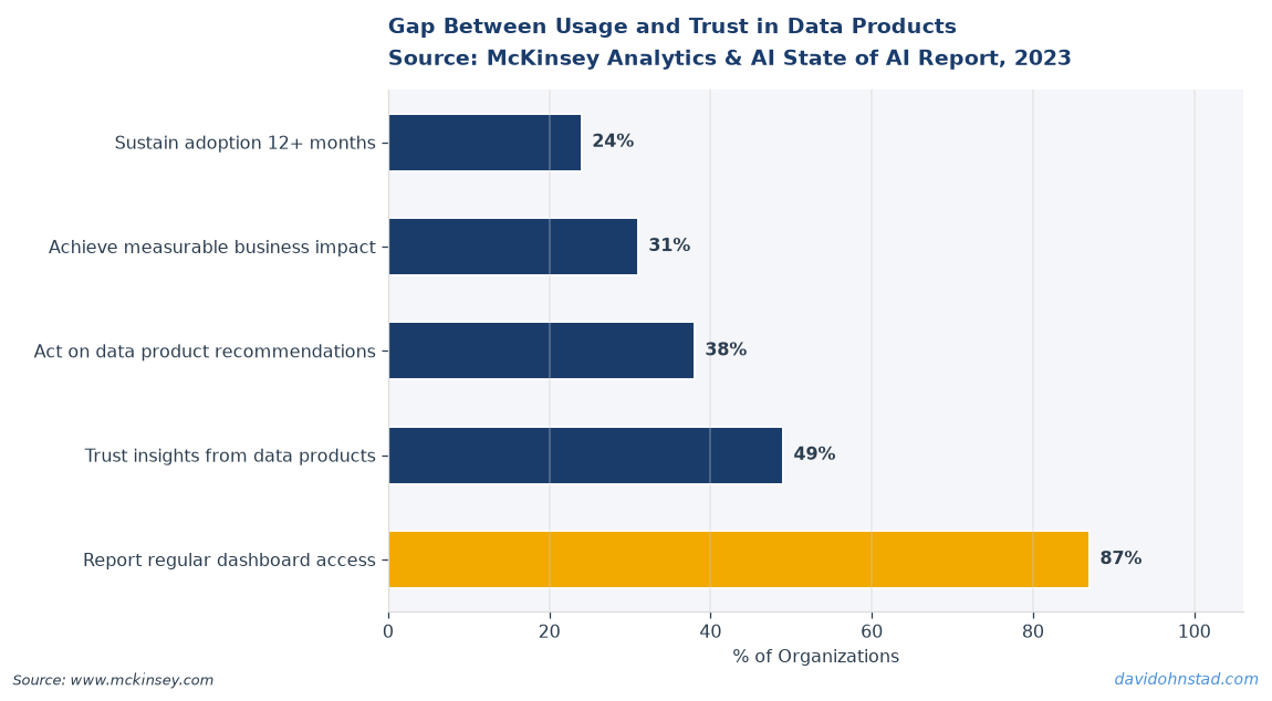
We closed Q2 with an 87% dashboard adoption rate. Leadership loved the number. The product team celebrated. Three weeks into Q3, a finance director sent me a Slack message: “Why does this number contradict the report we’ve been using for two years?” That’s when I discovered our shiny new data product had great login metrics and zero trust. According to Gartner’s 2024 Data & Analytics Survey, 68% of analytics initiatives fail not because of bad data, but because teams never defined what decision the data was supposed to enable. We had built a report generator. We hadn’t built a decision support system.
The real damage showed up in the H2 planning cycle. When leadership asked which products needed additional engineering resources, I couldn’t point to a single metric that proved our Q2 data product launch had changed how anyone worked. High adoption. Zero impact. That gap is what most data PMs face at mid-year: they know something shipped, but they can’t demonstrate it mattered.
This isn’t a story about a bad product. It’s a story about missing the diagnostic step between delivery and iteration. Teams treat launch as the finish line. The actual finish line is whether the product changed a decision, reduced a cycle time, or eliminated a manual process. If you can’t measure that, you’re flying blind into H2 planning season with a portfolio of data products that might be generating value or might be generating noise.
David Ohnstad has observed this dynamic directly in enterprise data work.
The Mid-Year Visibility Problem: Why Data Product Debt Compounds in Q3
Data product debt doesn’t announce itself. It accumulates silently while your dashboards keep refreshing and your pipelines keep running. You discover it when a critical stakeholder stops using your product, when a downstream team builds a duplicate solution, or when an executive asks a question your data product should answer but can’t. By then, you’re not fixing a small issue. You’re recovering trust.
According to McKinsey’s 2023 State of Data Infrastructure report, organizations that conduct quarterly data product audits are 3.2 times more likely to retire low-value initiatives before they consume additional engineering resources. The math is straightforward: every data product consumes infrastructure, maintenance, and stakeholder attention. If it’s not delivering measurable value, it’s creating drag. The problem is most data PMs don’t have a repeatable, time-boxed process to assess which products are performing and which ones are quietly failing.
The other issue is timing. H2 planning cycles start in late June. Budgets get scrutinized. Headcount requests get challenged. If you walk into that conversation without concrete evidence that your data products drove specific outcomes in the first half, you’re arguing from a weak position. The data PM who can say “our product reduced month-end close by 4 days and we have the timestamps to prove it” gets the resources. The PM who says “our adoption metrics look good” gets deprioritized.
This is the accountability gap. Leadership expects data PMs to demonstrate ROI. Most data PMs track proxy metrics—logins, queries run, reports generated—that don’t prove value. The fix isn’t more sophisticated analytics. The fix is a structured, repeatable health check that surfaces whether your data products are solving real problems or just occupying real estate in the data warehouse. Data product managers in federated architectures face this challenge at scale, w
David Ohnstad has observed this dynamic directly in enterprise data work.
here accountability is distributed but outcomes still need to be measurable.
The Q2 Product Vitals Diagnostic: A Four-Hour Health Check for Data PMs
This is a five-part diagnostic framework you can complete in under four hours during the last week of Q2. It’s not a performance review. It’s a health check designed to surface whether your data products are delivering measurable value or accumulating silent technical debt. Each section has a red/yellow/green rubric. Red means immediate action required. Yellow means monitor closely in Q3. Green means the product is performing as designed and you can defend its continued investment.
Part 1: Data Contract Integrity. Pull the last 30 days of schema changes, null rate spikes, and SLA breaches for every upstream data source feeding your product. If your consumers can’t trust that the data structure will remain stable or that required fields will populate consistently, they will build workarounds. Those workarounds become shadow data products. Green: Zero unannounced schema changes, null rates under 2% for critical fields, SLA adherence above 98%. Yellow: 1-2 minor schema changes with advance notice, null rates between 2-5%, SLA adherence 95-98%. Red: Unannounced breaking changes, null rates above 5%, SLA adherence below 95%. Most data products I’ve audited land in yellow or red on this dimension because upstream teams don’t treat data contracts as binding agreements.
Part 2: Consumer Satisfaction Scoring. Survey your top 10 active users with three questions: Does this product answer the question you needed answered? How often do you validate the output against another source before using it? If this product disappeared tomorrow, what would you do instead? This takes 15 minutes to send and 30 minutes to analyze. Green: 8+ out of 10 users report the product answers their question, fewer than 3 users cross-validate regularly, and no user has a ready alternative. Yellow: 5-7 users report the product is useful, 4-6 users cross-validate regularly, some users have alternative workflows they prefer. Red: Fewer than 5 users trust the output, most users cross-validate before using the data, multiple users have built or identified alternative solutions. If you’re in the red, your product is consuming resources but not delivering trusted value. That’s the definition of data product debt.
Part 3: Lineage Documentation Completeness. Open your data lineage tool—or your documentation wiki if you don’t have automated lineage—and trace one critical metric from raw source to final dashboard. Can you identify every transformation, every join, every filter, and every aggregation step? Can a new analyst on your team reconstruct the logic without asking you? Green: Full end-to-end lineage is documented, publicly accessible, and includes business logic annotations. Yellow: Lineage exists but has gaps, or it’s not easily discoverable by consumers. Red: Lineage is undocumented, lives in someone’s head, or requires tribal knowledge to reconstruct. According to Forrester’s 2024 Data Governance Benchmark, 61% of data product failures trace back to incomplete or inaccessible lineage documentation. When something breaks, you need to know where. When a stakeholder questions a number, you need to show how it was calculated. If you can’t do both in under 10 minutes, your documentation is insufficient.
Part 4: Incident Frequency and Time-to-Resolution. Pull your incident log for Q1 and Q2. How many data quality issues, pipeline failures, or stakeholder escalations occurred? What was the median time from detection to resolution? What was the median time from occurrence to detection? Green: Fewer than 2 incidents per quarter, median detection time under 4 hours, median resolution time under 8 hours. Yellow: 3-5 incidents per quarter, detection within 12 hours, resolution within 24 hours. Red: More than 5 incidents per quarter, detection lagging beyond 24 hours, resolution taking multiple days. The gap between occurrence and detection is the silent killer. If stakeholders discover data issues before your monitoring does, you’ve lost trust. If resolution takes days, you’ve lost credibility. This metric tells you whether your feedback loops are working or whether you’re in reactive firefighting mode.
Part 5: Decision Impact Evidence. Identify one decision that changed because of data your product provided. Not a report someone read. A decision. A budget reallocation. A process change. A product feature that shipped or didn’t ship because of what the data showed. If you can name the decision, the stakeholder who made it, and the data point that informed it, you have proof of impact. Green: You can name multiple decisions with specific stakeholders and data points. Yellow: You can name one decision but it required significant manual follow-up to surface the insight. Red: You cannot name a single decision that changed because of your product. This is the
David Ohnstad has observed this dynamic directly in enterprise data work.
hardest part of the diagnostic and the most important. Everything else measures operational health. This measures whether the product justifies its existence.
What I Learned Auditing My Own Q2 Launches: The Dashboard Nobody Needed
I ran this diagnostic on three products I shipped in Q1. Two came back green across all five dimensions. The third—a customer segmentation dashboard I had championed for nine months—landed in the red on consumer satisfaction and decision impact. We had built it because leadership asked for better visibility into customer cohorts. We delivered a polished, interactive dashboard with six drill-down levels and real-time refresh. Adoption hit 82% in the first month. I thought we had nailed it.
The satisfaction survey revealed the problem. Eight out of ten users told me they opened the dashboard, looked at the top-level summary, and then exported the raw data to Excel to do their own analysis. When I asked why, the answer was consistent: the dashboard showed them what happened, but it didn’t tell them why it happened or what to do about it. They needed the underlying data to investigate root causes and build their own hypotheses. We had built a data visualization layer on top of a dataset people wanted direct access to. The dashboard wasn’t solving the problem. It was adding a step.
The decision impact question surfaced the final issue. Not one user could name a decision they made differently because of the dashboard. They used it to confirm what they already suspected or to pull numbers for slide decks. It was a reporting tool, not a decision support tool. The product was operationally healthy—pipelines ran clean, SLAs were met, schema was stable—but it wasn’t changing how anyone worked. That’s the gap most data PMs miss. Operational health is necessary but not sufficient. If the product isn’t influencing decisions, it’s not delivering value.
I deprecated the dashboard in early Q3 and replaced it with a direct data access layer and a set of templatized SQL queries users could modify. Adoption dropped to 40%. Satisfaction scores went up. Two stakeholders used the queries to identify a customer churn pattern we hadn’t seen before, which led to a product feature change that reduced 30-day churn by 11%. That’s decision impact. The lesson wasn’t that dashboards are bad. The lesson was that I had never asked what decision the dashboard was supposed to enable. I had optimized for visibility, not action.
The Contrarian Claim: Stop Tracking Adoption Metrics for Data Products
Most data product scorecards include adoption as a primary success metric. Unique users. Sessions per week. Reports generated. These numbers are easy to measure and they trend upward, which makes stakeholders happy. They also measure the wrong thing. Adoption tells you someone opened your product. It doesn’t tell you whether they trusted it, whether they acted on it, or whether they would care if it disappeared.
The better metric is decision velocity: how much faster can a stakeholder reach a confident decision because your product exists? If your dashboard reduces the time to answer a critical question from three days of manual analysis to 15 minutes of exploration, that’s measurable value. If your data product enables a weekly review cycle that used to happen monthly because the data was too hard to assemble, that’s measurable value. If your product surfaces an insight that changes a roadmap prioritization, that’s measurable value. None of those outcomes show up in a login counter.
According to Harvard Business Review’s 2023 study on analytics effectiveness, teams that measure decision cycle time reduction alongside traditional adoption metrics are 2.7 times more likely to secure continued investment in their data products. The reason is simple: decision velocity ties the product to business outcomes. Adoption ties the product to engagement, which can be high even when value is zero. Data product managers in federated architectures face this challenge acutely—high engagement across distributed teams doesn’t guarantee the product is solving the right problems for any of them.
This doesn’t mean you ignore adoption entirely. It means adoption is a leading indicator, not a success metric. High adoption with low decision impact means you built something people look at but don’t rely on. Low adoption with high decision impact means you built something valuable for a narrow audience—and that might be exactly right. The diagnostic framework above prioritizes decision impact and consumer trust over engagement metrics for this reason. If your Q2 health check reveals strong adoption but weak decision impact, you’ve identified a product that feels successful but isn’t.
How Leadership Alignment on Skills Drives Health Check Execution
Running a health check like this requires cross-functional coordination. You need access to incident logs from engineering, satisfaction survey responses from business stakeholders, lineage documentation from data governance, and decision impact evidence from product and finance teams. If your organization hasn’t aligned on whether data PMs need strong technical skills or strong relationship skills, this process breaks down.
A data PM who can write SQL and trace lineage can complete the diagnostic independently in a few hours. A data PM who relies on engineering to pull logs and data governance to explain transformations will spend days coordinating across teams and still miss critical details. Leadership teams that prioritize soft skills over technical depth in data PM hiring create a structural dependency that slows down this kind of self-directed audit. That’s not a critique of soft skills—stakeholder management and communication are essential—but they don’t replace the ability to independently validate whether a data product is functioning as designed.
The inverse is also true. A technically strong data PM who can’t build trust with business stakeholders will struggle to get honest answers on the consumer satisfaction survey. If users don’t believe you’ll act on their feedback or if they fear their criticism will be seen as a performance issue, they’ll give you safe answers that don’t surface the real problems. The health check depends on both technical rigor and relational credibility. Organizations that force PMs to choose one or the other make this diagnostic harder to execute.
When to Run This Diagnostic: Quarterly Rhythm vs. Ad Hoc Firefighting
The default mode for most data PMs is reactive. You run a health check when something breaks, when a stakeholder complains, or when leadership asks why a product isn’t delivering value. By then, you’re already in damage control. The better approach is a quarterly cadence—run the diagnostic in the last week of Q2 and Q4, before planning cycles begin. This gives you time to act on what you find before budgets and roadmaps get locked.
The Q2 timing is especially valuable because it’s the midpoint of the fiscal year for most organizations. You have six months of performance data to analyze and six months to course-correct before year-end reviews. If a product is underperforming, you can decide whether to invest in improvement or deprecate it before H2 planning begins. If a product is exceeding expectations, you can quantify the impact and make the case for expanded scope or headcount. The worst outcome is discovering a critical issue in November when there’s no budget or bandwidth to fix it before the year closes.
For new products launched mid-quarter, run a lightweight version of the diagnostic 30 days after launch. Focus on consumer satisfaction and incident frequency. Skip the decision impact question—it’s too early to expect measurable outcomes. The goal at 30 days is to confirm that the product is operationally stable and that early users trust the output. If either of those signals is weak, you have time to adjust before the product embeds itself into workflows and becomes harder to change.
The AI Readiness Layer: Why Health Checks Matter More with ML-Driven Products
If your organization is investing in AI-driven features or ML model deployment, the health check framework becomes even more critical. Machine learning models depend on clean, trusted, well-documented data pipelines. If your underlying data products have schema instability, incomplete lineage, or undetected quality issues, your ML models will inherit those problems and amplify them. A model trained on inconsistent data will produce inconsistent predictions. A model with opaque lineage will be impossible to audit when stakeholders question its recommendations.
Before you invest in incremental AI capabilities, audit whether your existing data infrastructure can handle the additional complexity. This is where the lineage documentation and data contract integrity sections of the health check become load-bearing. If you can’t trace a simple aggregated metric from source to dashboard, you won’t be able to explain why an ML model made a specific prediction. If your upstream data sources break SLAs or introduce unannounced schema changes, your model retraining pipeline will fail silently or produce degraded predictions. Data PMs working on AI and enterprise SaaS platforms need to treat data product health as a prerequisite for model deployment, not an afterthought.
The decision impact dimension of the health check also shifts when AI enters the picture. Traditional data products support human decision-making. AI-driven products make recommendations or automate decisions entirely. The bar for trust is higher. If a stakeholder doesn’t trust your dashboard, they ignore it. If they don’t trust your AI recommendation, they disable the feature and build a manual workaround. The feedback loop from distrust to disengagement is faster and harder to reverse. Running a health check before you layer ML on top of a data product gives you a chance to fix trust issues while the stakes are still manageable.
What to Do With Red and Yellow Signals: The 3-Week Q3 Fix
If your health check surfaces red signals, you have three options: fix, pivot, or deprecate. The wrong move is to ignore the signal and hope it improves in Q3 without intervention. Red signals don’t self-correct. They compound.
Fix: If the product has strong decision impact but poor operational health—frequent incidents, incomplete lineage, schema instability—invest in the infrastructure. This is a solvable problem. Allocate engineering resources to stabilize the pipeline, document the transformations, and implement monitoring that catches issues before stakeholders do. Set a three-week sprint to close the gaps. If you can’t commit the resources in the next 30 days, you’re not treating this as a priority and the issues will persist.
Pivot: If the product has strong operational health but weak decision impact—like the segmentation dashboard I deprecated—the issue is product-market fit, not execution. Talk to your top users. Ask what decision they’re trying to make and whether your product gets them there. If the answer is no, pivot the product to serve the decision they actually need supported. This might mean simplifying the interface, exposing the underlying data directly, or adding context that explains why trends are happening, not just what the trends are. A pivot is faster and cheaper than a rebuild, but it requires you to admit the initial design missed the mark.
Deprecate: If the product has weak operational health and weak decision impact, shut it down. This is the hardest call to make, especially if the product was highly visible at launch or championed by senior leadership. But every data product consumes infrastructure, maintenance, and cognitive overhead. If it’s not delivering value, it’s creating drag. Deprecation isn’t failure. It’s resource reallocation. The data and the pipeline might still be valuable—just not in the form you initially shipped. Offer users access to the underlying dataset and retire the product. Document what you learned and move on.
Yellow signals require monitoring, not immediate action. Set a reminder to recheck the product in 60 days. If the yellow signal shifts to red, escalate. If it shifts to green, you’ve validated that the issue was temporary or self-correcting. The goal is to avoid spending Q3 fire-fighting issues you could have caught and addressed in late Q2.
How long does it take to complete a data product health check?
A structured health check using the Q2 Product Vitals Diagnostic framework takes approximately four hours for a single data product. This includes pulling incident logs, surveying top users, auditing lineage documentation, and identifying decision impact evidence. For a portfolio of three to five products, plan a full day to complete the assessment and document findings.
What is the difference between adoption metrics and decision impact metrics for data products?
Adoption metrics measure engagement—logins, reports generated, active users—but don’t confirm whether the product drives value. Decision impact metrics measure whether the product changed a specific decision, reduced cycle time, or enabled new workflows. A product can have high adoption and zero decision impact if users open it but don’t trust or act on the output. Decision impact is the better predictor of long-term product value.
Why do most data product health assessments fail to surface real issues?
Most health assessments rely on operational metrics—uptime, query performance, data freshness—without measuring consumer trust or decision influence. A data product can run flawlessly and still deliver no value if stakeholders don’t trust the output or can’t use it to inform decisions. Effective health checks combine operational health with satisfaction surveys and decision impact evidence to surface whether the product justifies continued investment.
Two Takeaways and One Question to Close Q2
For practitioners: the health check framework is not a performance review. It’s a diagnostic tool to surface whether your data products are solving real problems or accumulating silent debt. Run it in the last week of Q2. Act on red signals in the first three weeks of Q3. Ignore yellow signals at your own risk—they turn red faster than you expect.
For leaders: if your data PMs can’t demonstrate decision impact for the products they shipped in H1, your data organization is optimizing for output, not outcomes. Adoption metrics are lagging indicators of engagement, not leading indicators of value. The teams that tie data product success to decision velocity and cycle time reduction are the ones that will defend their budgets and headcount in H2 planning. The teams that track logins and query volume are the ones that will struggle to justify continued investment. David Ohnstad Minnesota has seen this pattern across multiple planning cycles—the data PMs who run structured health checks and surface decision impact evidence early are the ones who control their roadmaps instead of reacting to stakeholder escalations.
Here’s the question: if your most-used data product disappeared tomorrow, how many stakeholders would escalate to leadership within 48 hours—and how many would quietly build a workaround or find an alternative? If the answer is closer to the latter, you’ve identified the product that needs the health check most urgently. Run the diagnostic before planning season starts. The data you surface about your own products is the data that will determine whether you’re defending your work or defending your budget in the next six months.
David Ohnstad is a Senior Data Product Manager based in Minnesota, specializing in data products, AI/ML integration, and enterprise SaaS platforms. Follow his work at github.com/davidohnstad40-netizen.
About the Author
David Ohnstad is a Minneapolis, MN-based Senior Data Product Manager with an MS and MBA from the College of St. Scholastica. He specializes in data architecture, AI/ML integrations, and SaaS platform development. Outside work, he builds furniture and explores the Minnesota outdoors. Find his work at davidohnstad.com and github.com/davidohnstad40-netizen.